
Caron
Making the first step feel possible
We helped Caron create a more empathetic digital experience, helping people find answers and feel confident taking the vital next step toward care.
01 — Opportunity
When every next step matters
People often arrive at Caron during one of the most difficult moments of their lives, searching for help for themselves or someone they love. They may not know what kind of treatment they need, where to begin, or even what questions to ask.
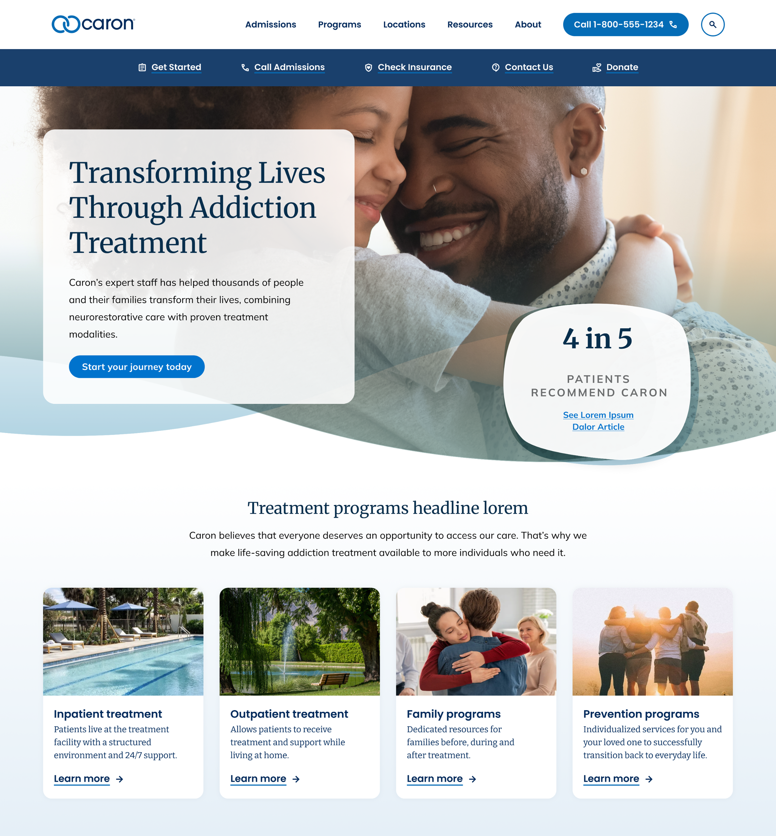
There was an opportunity to make that first step feel a little easier. By bringing important information forward, simplifying how people explored programs, and making pathways to human support more visible, the digital experience could better meet people where they were.
We set out to create an experience rooted in empathy: one that could reduce uncertainty, remove unnecessary barriers, and help people feel supported from the moment they began looking for care.
- Strategy
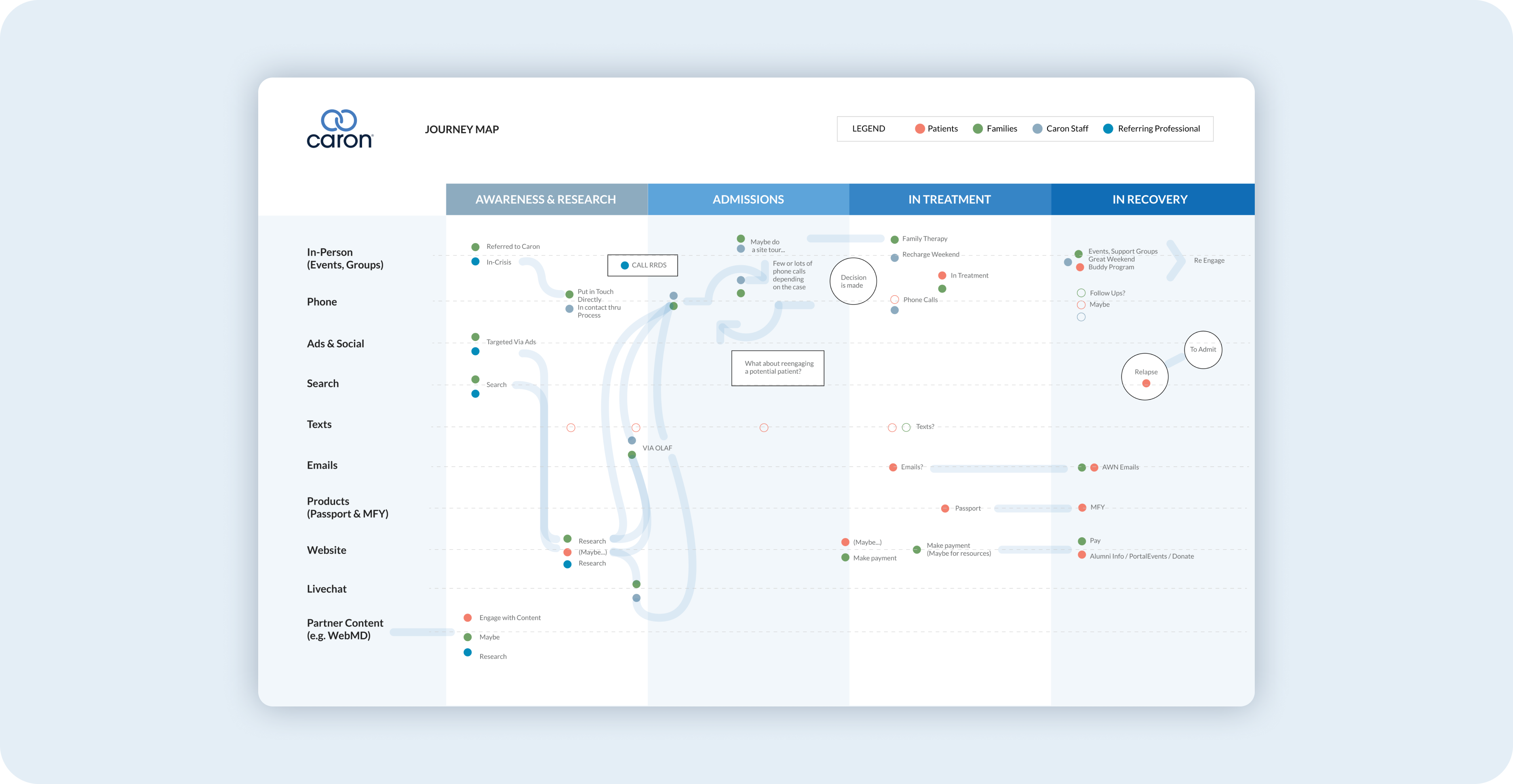
- We combined interviews, journey mapping, analytics, and ongoing behavioral data to understand the emotions, questions, and decisions behind the search for treatment, and where the experience was getting in their way.
- Design
- We simplified the information architecture and created clearer pathways through programs, locations, admissions, and other critical treatment information.
- Engineering
- We connected content, marketing, and the digital experience within a scalable foundation that could continue evolving alongside Caron’s services and the needs of the people they serve.

02 — Research & Strategy
Understanding the journey before changing the path
Designing for someone in a vulnerable moment requires more than understanding what they click. We needed to understand what they were going through.
Conversations with patients, families, and referring professionals helped us uncover the questions, uncertainty, and emotional barriers surrounding the search for treatment. We combined those perspectives with journey mapping and behavioral data to identify where the digital experience could provide reassurance, clarity, and a more obvious way forward.
That understanding became the foundation for every decision that followed.
03 — UX & Design
Reducing the barriers between people and help
We redesigned the experience around a simple principle: people looking for treatment shouldn’t have to understand Caron’s organizational structure before they can find help.
Navigation became simpler. Programs and locations became easier to understand. Important questions were answered sooner. And opportunities to connect with a real person became clearer throughout the experience.
Every decision was intended to reduce cognitive and emotional burden, helping people focus less on navigating a website and more on deciding what was right for themselves or someone they cared about.

04 — Ongoing Optimization
A journey shaped by the people on it
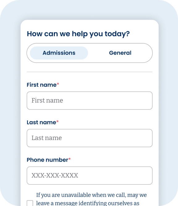
As we learned more about how people moved through the experience, we identified new opportunities to reduce friction around some of the most consequential moments: exploring treatment, understanding admissions, choosing whether to call, and deciding whether to complete a form.
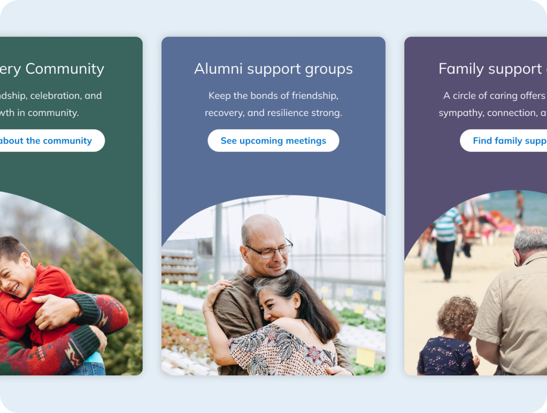
That led to ongoing improvements designed around the realities of the people using them: fewer unnecessary decisions, clearer expectations, more reassuring language, simpler forms, and more consistent access to Caron’s admissions team.
The experience continues to evolve as we learn more about what people need when they reach out for help.

