
Illustrations can be a powerful tool to create positive experiences for your users. They can be a missing piece to the puzzle if your users are struggling in their journey using your digital product.
Illustration in UX isn’t the same kind of editorial illustration you’d find accompanying an article in a magazine. While those designs could easily be replaced with a photograph, UX illustration has a big job to assist users along their journey. The purpose of illustration in UX design is to convey a message or idea, clarify the complex, and create visual interest. Simple icons may not be enough to aid users if the ideas are too complicated and photographs can be easily misinterpreted or glossed over.
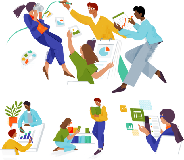
Learn the process behind illustrator and muralist Alice Lee’s beautiful work for Slack!
The most important questions to ask yourself when making decisions about illustration are:
- What is the purpose of your product?
- What job is the illustration doing?
- Is it communicating information?
- Is your illustration in the right place?
- Does it use the same visual identity and voice as your brand?
- Is it accessible?
- Is it visually or emotionally appealing?
Illustration’s purpose
The amount of imagery used should be determined by its purpose. For example, a portfolio website for an artist or an e-commerce site selling makeup may require more imagery than a news website or a blog. In both of the examples shared, photographs would be the way to sell their products. You’d want to see a direct representation of what you’re spending money on before committing to purchase it. However, an illustration might come in handy for an action the user needs to take next in their journey.
While illustrations can help to guide a user in their journey, stock photos can create barriers. Users know when a stock photo isn’t relevant to your brand or your message, and it can put distance between you and your audience. A generic photo of a woman on a cell phone is barely helping a user understand your product — and chances are that exact photo has been used elsewhere before. Users tend to ignore images that are purely decorative and aren’t information-carrying (Nielsen Norman Group, 2010). Creating imagery that is unique to your brand can do wonders for engaging visitors — and earning their loyalty.
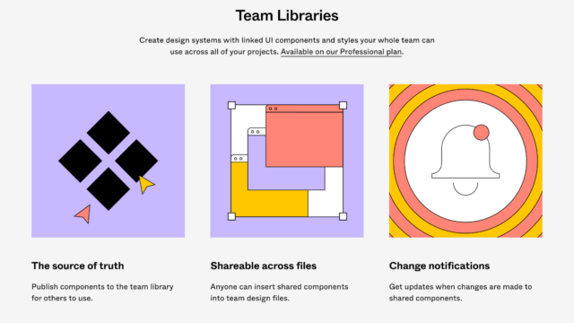
Figma is our design tool of choice at O3. Figma does a wonderful job utilizing imagery across the various pages of their website. The illustrations are simple, informative, and utilize visuals in use within the program itself so once a user starts using Figma, it will feel familiar.
It’s important to consider illustration early in the design process. Adding illustrations on top of content like confetti to fill space is not the way to include imagery on your product. It’s better to be purposeful and clutter-free with imagery than to bombard visitors with too much fluff. Consider testing to get feedback on how helpful the illustrations are for your users.
To recap:
- Ideate illustrations during the overall design process.
- Ensure there is a clear idea or series of ideas you are representing.
- Don’t use illustrations to fill or decorate space — use them with intent.
- Test with users to validate.
Content hierarchy
Ensuring your users know exactly where to look to find the information they need is vital. Users tend to skim pages and look at subheaders, keywords, lists, and images to guide them. Breaking up copy into simpler, easier-to-skim bites is the best way to keep users engaged.
By adding helpful illustrations, this information becomes much more memorable. The most important content should have priority and be emphasized with imagery, while less important content can have fewer images or no images at all.
Be careful about overdoing it, though. If more than the essentials are emphasized, it can be overwhelming for users and make it difficult for them to focus on the most important content. By showing restraint with imagery and tightening your users’ focus, you can guide users’ attention to the most important information and calls to action.
Decide on the most important pieces of your page.
- Emphasize these areas with meaningful subheaders and illustrations.
- Practice restraint to not confuse visitors.
- Validate with user testing.
Uniting your brand
Illustration is a great way to add color to your brand and convey your unique voice. It can be used to reinforce your brand’s visual identity and personality. Consistent use of illustrations that reflect the brand’s values and messaging can create a cohesive and memorable user experience.
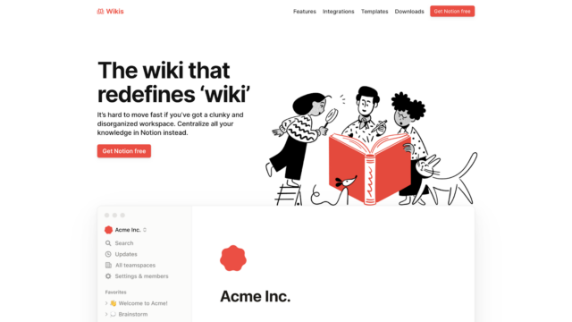
One of O3’s favorite tools is Notion, and they use illustration and color beautifully throughout their website to tell their story and engage visitors.
Having unique illustrations can help users remember your brand especially if they’re also looking at your competitors. It can help differentiate between similar products or services and help users choose the one that resonates with them the most — which is hopefully yours! Having a cohesive brand experience goes a long way for credibility, so anything you can do to earn the trust of users is a win.
Improve brand recognition.
- Flex your brand’s point of view.
- Create a positive first impression for new users.
- Encourage visitors to explore the site further.
- Gain the trust of your users.
Accessible design
Accessibility should be on your radar already — you can read all about O3’s principles for accessible design here. Meaningful illustrations are a great way to enhance the design of your product while practicing inclusivity. Committing to accessible experiences widens your audience to include those with disabilities or language barriers.
Illustrations work as a simplified visual aid for complex ideas and can assist users with various needs — not just disabilities! As an example, descriptive alt text can be added to illustrations to provide context and ensure that all users, sighted or not, can understand the content of the product. Similarly, someone who might not speak the language in use could find the right product they need based on the imagery used to advertise it rather than the copy.
Being mindful of those with cognitive disabilities is a great way to think about how much is too much. Too many images that are trying to convey a lot of ideas can be overstimulating, confusing, or downright stressful. Striking the right balance between text and images can help create a more engaging and effective user experience for everyone, not just those with disabilities.
It’s also important to consider not everyone has access to high-speed internet 24/7. Visitors expect a website to load quickly, and slow loading times can increase bounce rates. It’s crucial to optimize images and consider their file size to ensure the fastest loading times available to users, regardless of access to the internet. (Did you know alt text is useful for slow loading times?)
Keep these pain points in mind while designing:
- Cognitive disabilities can prevent users from engaging with content that is too complex.
- Always add alt text and provide relevant copy for those with vision impairment.
- Reading disabilities or reading level can affect how users understand your product.
- Imagery should be understood regardless of language barriers.
- Internet speed/availability varies, so ensure your content is legible even if images won’t load.
Connecting with your users
The right illustrations are delightful. Well-designed illustrations can enhance the visual appeal of a product, making it more attractive and engaging for visitors. Illustrations can evoke emotions and create a sense of connection with the product and its content.
For example, using whimsical or playful illustrations can make an experience more lighthearted and fun, while more serious or realistic illustrations can create a sense of professionalism or authority. Keep your brand tone in mind when designing how your illustrations look and feel — consistency is key.
Think about every 404 error page you’ve ever landed on. Have any of them ever made you smile? Illustration can be a soothing balm for the pain points a user might experience using your product. As a user, knowing that my bad experience has already been thought about and considered makes me feel like I’m in good hands.
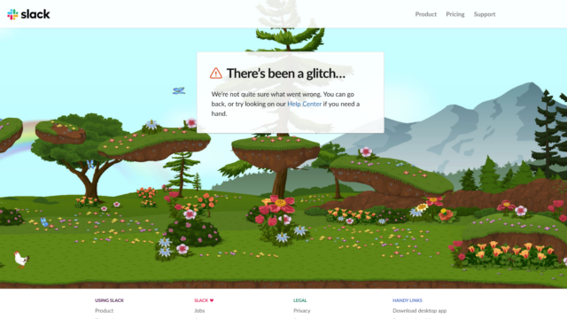
Another O3 must-have is Slack, and their 404 page is an interactive playground!
Keep in mind how a user feels when designing:
- Emotionally connect to and engage users with branded illustrations.
- Consider the pain points users might encounter on their journey.
- Keep the brand tone in mind.
- Use illustration consistently across all channels.
Illustration in UX design isn’t as easy as buying a stock image and placing it in the middle of your homepage. It takes a lot of thought and creativity to make effective illustrations and even more thinking to use them correctly. It’s worth the extra time and effort when it means securing an engaged, loyal audience.
If your brand wants to harness the power of illustrations to create positive experiences for your users, let’s connect.
About the contributor
O3 helps organizations unlock growth and streamline operations through smart strategy, human-centered design, and integrated technology. We’re also the force behind the 1682 Conference, where leaders explore how AI shapes profit and process. Learn more about our work and innovation.