
The world is a vibrant and colorful place, but for some, it can be challenging to navigate. As designers, it is our responsibility to ensure that our work is not only visually appealing but also accessible to all users. One key aspect of creating accessible designs is the appropriate use of color contrast ratios. This article aims to illuminate the benefits of using color contrast ratios and how to effectively apply them in your designs.
Understanding color contrast ratios
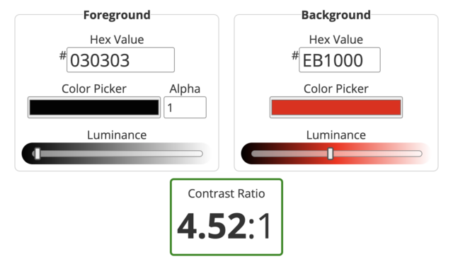
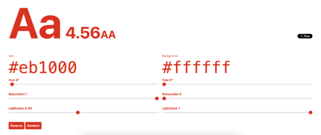
Color contrast ratios are the difference in light between the foreground color (the color of the text) and the background color. It’s a numerical value that ranges from 1:1 (no contrast) to 21:1 (maximum contrast). A high contrast ratio makes text more legible and content more distinguishable for users with visual impairments. The Web Content Accessibility Guidelines (WCAG) recommend a minimum contrast ratio of 4.5:1 for normal text and 3:1 for large text.
The role of color contrast ratios
Color contrast ratios play a crucial role in creating accessible designs. They ensure that the content is readable by everyone, including those with color vision deficiencies or other visual impairments. High-contrast colors help distinguish text from its background, making the content easier to read and understand. Apart from text, contrast is also required in interactive elements like buttons, forms, and icons, where low contrast can make these components difficult to identify.
While most elements need to meet color contrast requirements, WCAG lists a few page elements that do not have a contrast requirement. These include incidental elements, like text or images of text that are pure decoration, and logotypes, text that is part of a logo or brand name.
Integrate accessibility into your process
Several tools can assist designers in checking color contrast ratios. Websites like WebAIM and Colorable provide free resources to validate if your color combinations adhere to WCAG guidelines.
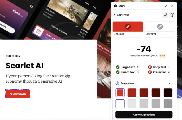
Additionally, Stark’s Accessibility Checker (available as a Chrome extension and/or Figma plugin) conveniently checks color combinations against WCAG guidelines and provides recommendations for any color combination that does not pass contrast requirements. Stark’s Accessibility Checker also features a vision simulator that designers can use to see how their designs render for people with vision deficiencies such as color blindness + blurred vision.
Integrating any of these tools into your work will provide invaluable support in the design process as well as ensure your designs are visually appealing and accessible to all users.
Good design is accessible design
Color contrast ratios are a fundamental aspect of accessible design. It’s crucial for designers to understand the requirements of color contrast ratios and apply suitable color contrast ratios in their work. With the right tools and a keen eye for color, designers can create visually stunning designs that are accessible to everyone.
Meet O3’s expert
Meet Simone Dehel, a certified expert in CPACC (Certified Professional in Accessibility Core) at O3. Simone is a Senior UX Designer who’s passionate about bridging the gap between accessible experiences and design. Simone is one of our leading accessibility champions at O3, is the founder of our culture club, and serves as a design mentor at ADP List. Simone embodies inclusivity, making sure accessibility is not just an add-on but a core part of creating experiences.
Our skilled designers are continuously expanding their knowledge and are here to address your inquiries on all things related to accessibility. Explore how our accessibility solution has transformed brands across industries and stay tuned for continued thought leadership.
About the contributor

O3 helps organizations unlock growth and streamline operations through smart strategy, human-centered design, and integrated technology. We’re also the force behind the 1682 Conference, where leaders explore how AI shapes profit and process. Learn more about our work and innovation.